
Overview
Blendstream, a media company that launched two years ago, is a freemium model that has a mobile app experience for both iOS and Android. Originally the business strategy was to first build a user base by offering a free product and then evolve to monetize on a premium (paid) product. The product has been well received and has a healthy user base of free users. Now an updated design experience is needed that will allow users to subscribe and pay a monthly fee.
Problem
Missed opportunity upon sign-in to increase conversion rate.
BlendStream aims to convert free users into paid subscribers. The existing signup and onboarding flow lacks a clear call-to-action for users to subscribe to the premium product during registration. One of the highest conversion rates occurs during the onboarding/sign-up stage. Additionally, minimal prominent calls-to-action within the free experience provide users with limited opportunities to upgrade or understand the compelling reasons to subscribe.
Solution
My Role
UX Resercher + UI Designer
Timeline
February 2024 - March 2024
Tools Used
Figma
To drive revenue growth and meet business objectives, BlendStream must develop an intuitive and compelling user experience. This experience should effectively prompt new users to subscribe upon registration, while also incentivizing returning free users to transition into paid subscribers within the app seamlessly.

Design Process


Discovery Research
Initial Analysis of Industry Leaders

Free users can access the app with no onboarding process.
Easy to understand how to navigate.
Access to share video across devices available at the top of the screen
The welcome screen has splash animation to draw user attention.
Option to close the Premium call to action at this time.
Free users can access to the app with no onboarding process.
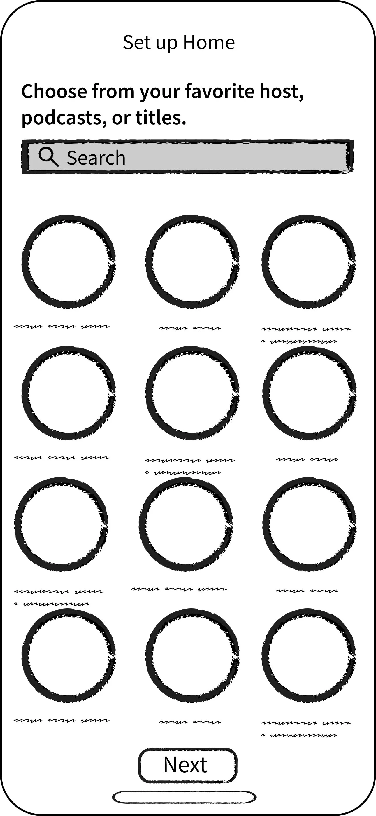
Search interests upon sign-in to create a dashboard.


Easy onboarding process upon downloading the app.
After free users register into the app, users can search for interests upon signing in to create their dashboard.
Quick access to categories at the top of the screen to sort and explore.
Horizontal scroll lets the user explore more of the page at once by section.
Option in the bottom navigation to access Premium Features
Displays all available plans to consider.
Competitor SWOT Analysis
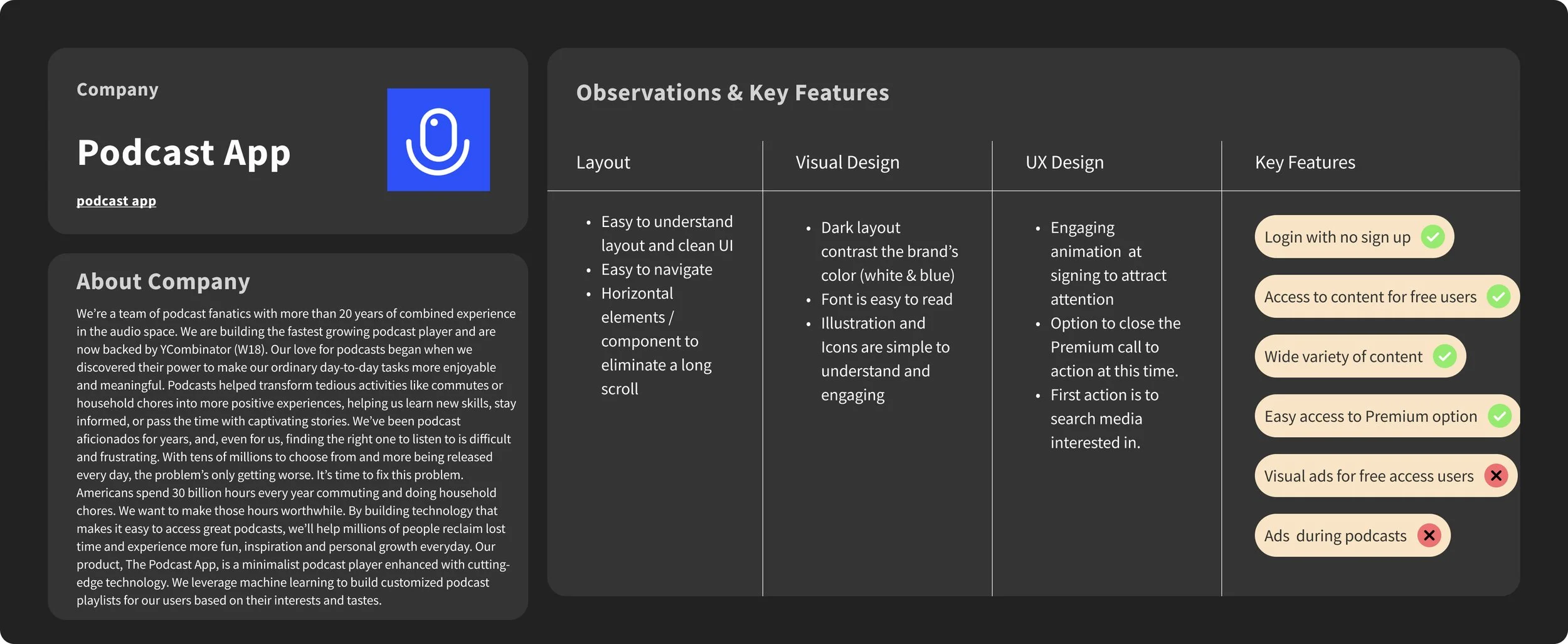
Podcast App
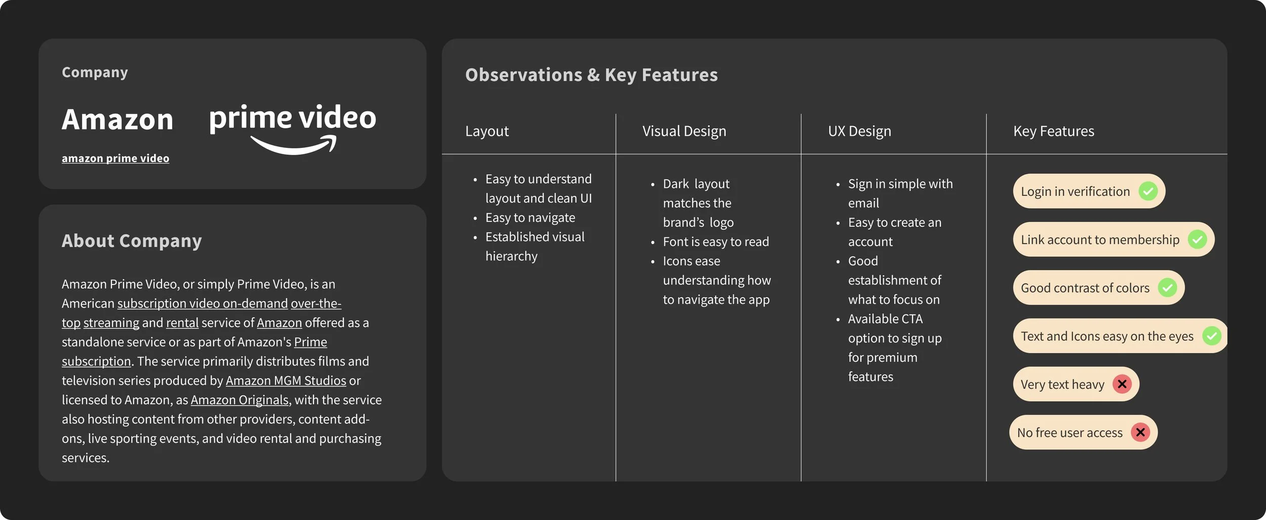
Amazon Prime Video

Audible

Patreon

Spotify

Youtube

Solution
How Might We Design a Solution that…
Encourage subscriptions at the initial sign-up stage
Remind users about the offers and features of premium
Prompt users to subscribe within the app
Indicate clear benefits of paid subscriptions

Target Persona
Age 18 - 24 years old
Very tech-savvy — they are on their phones for several hours a day
Very budget-conscious
Media [music/movies/books] is an essential part of their lives
Action Items
Easy access call-to-action for premium offerings available in the navigation for Free users.
Display on the sign-in screen how to use the app.Create a home dashboard for the user based on their preferences after signing in.
Horizontal scroll to navigate between media and scroll to explore different topics or genres.
Option to sort/filter between different media topics: (music, health, lifestyle, money, and finance)

Information Architecture User Journey Map
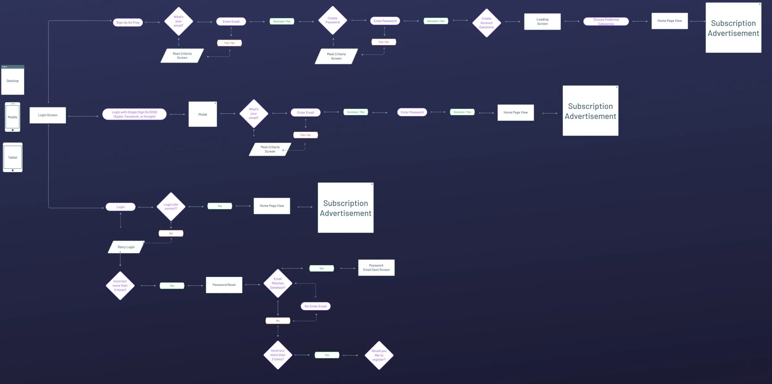
Premium Subscription User Flow
I proceeded by creating low fidelity wireframes that showcased the spacing and layouts. This also allowed me prioritize the main features and functions.


Wireframes


Design System Style Guide
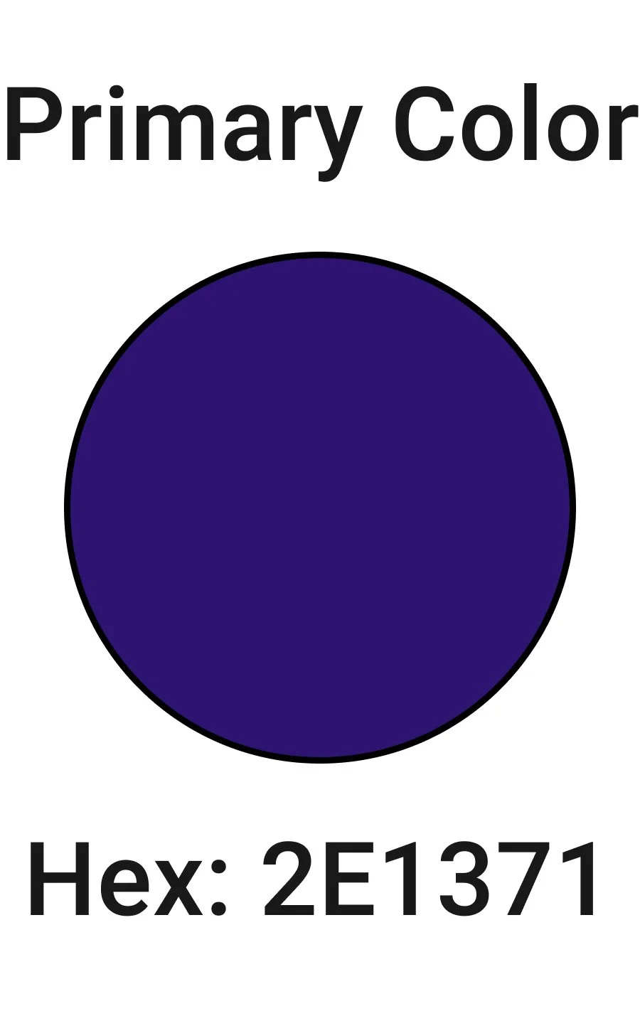
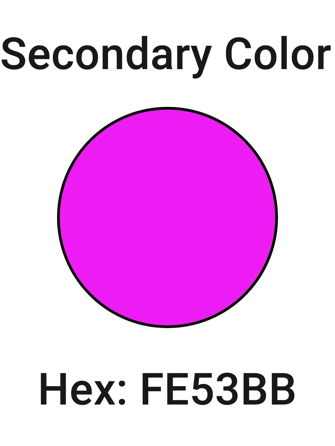
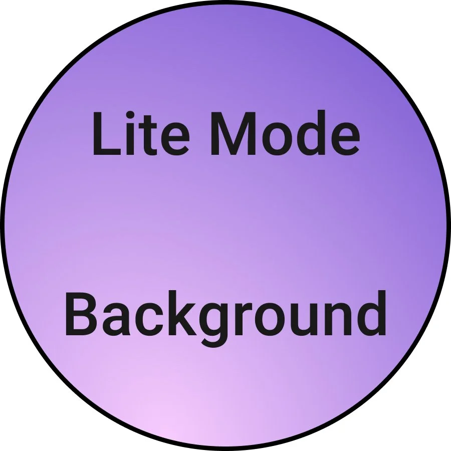
Color Palette


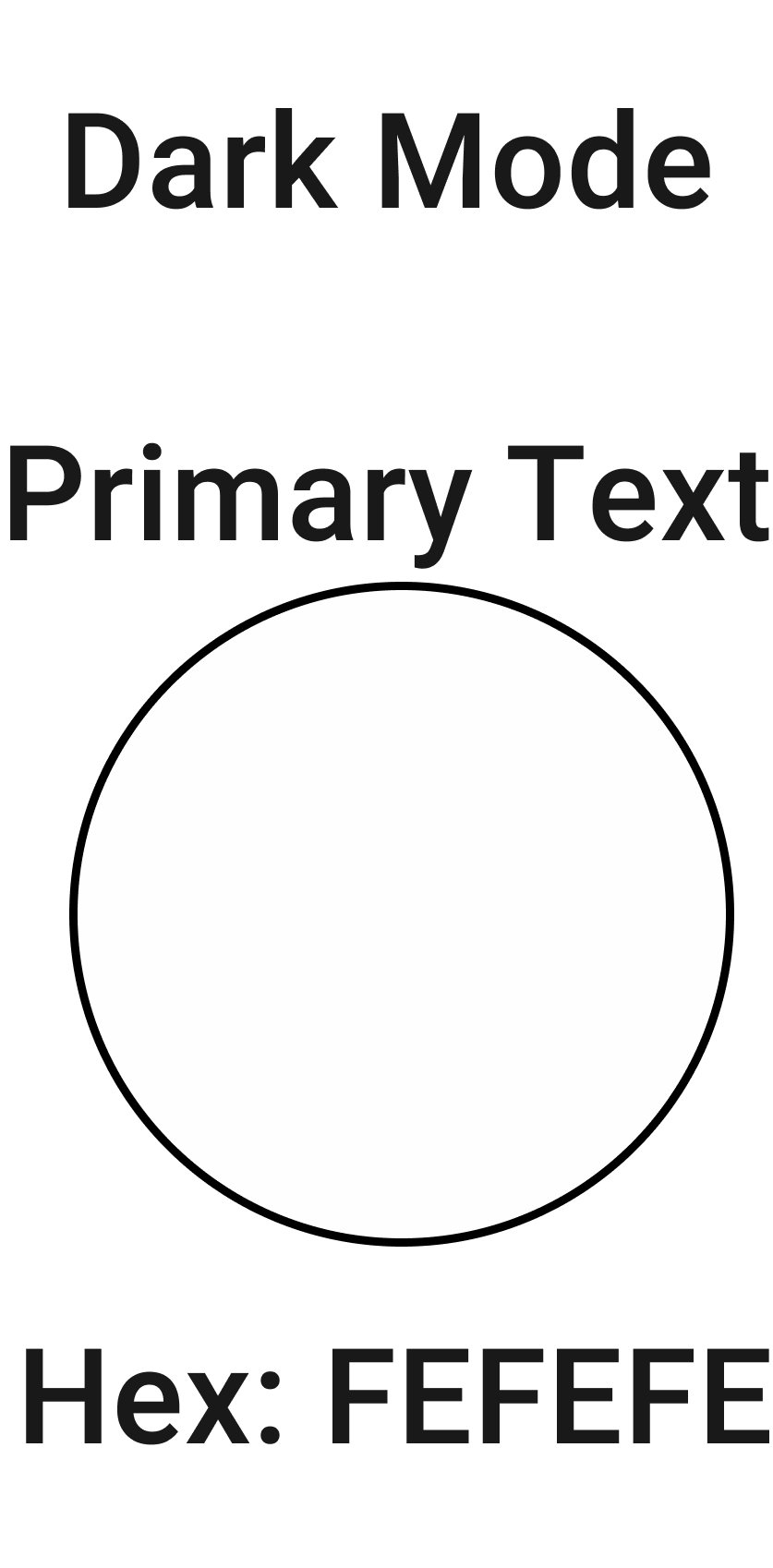
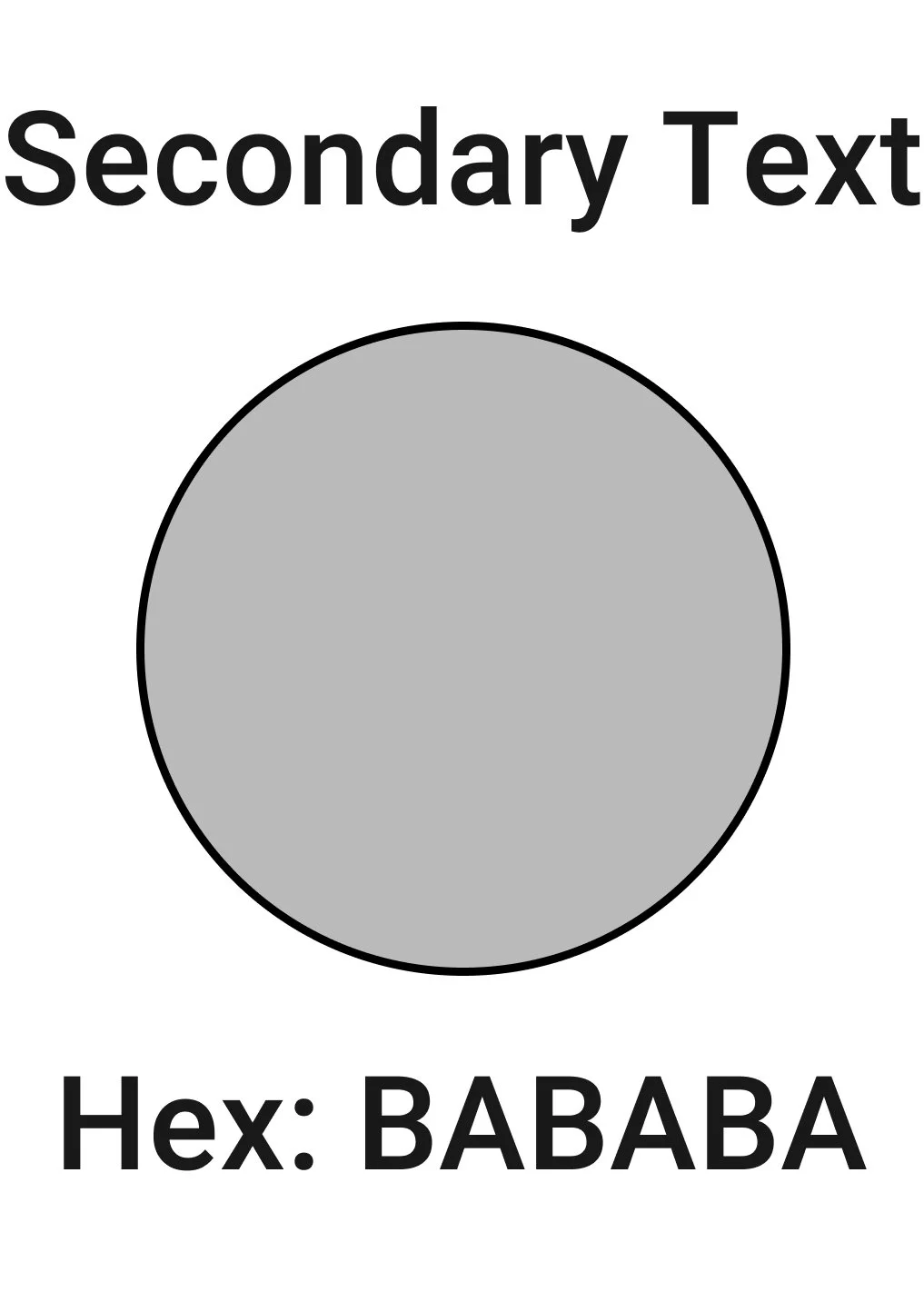

Text Color Palette
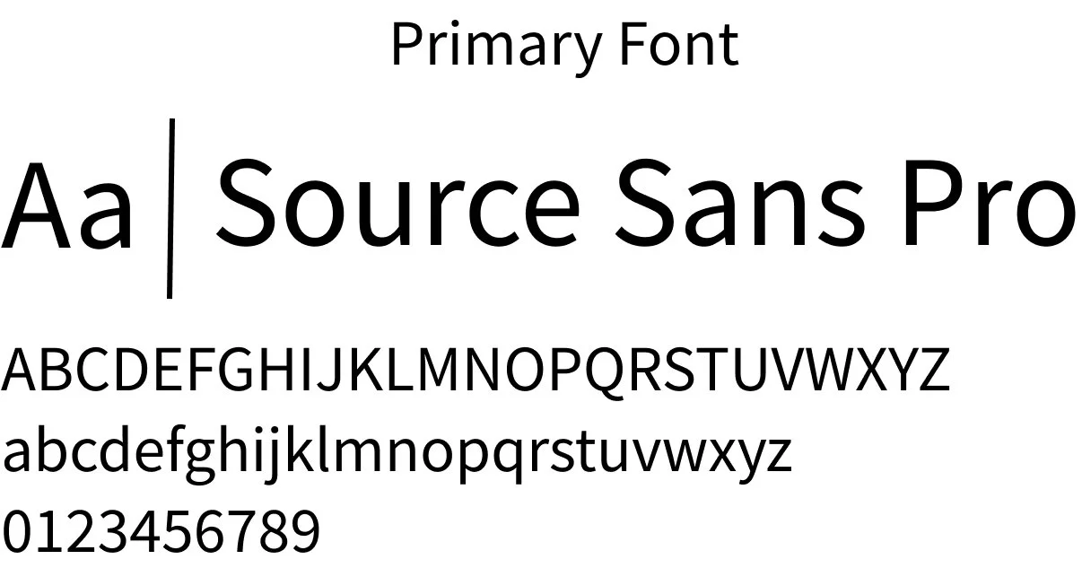
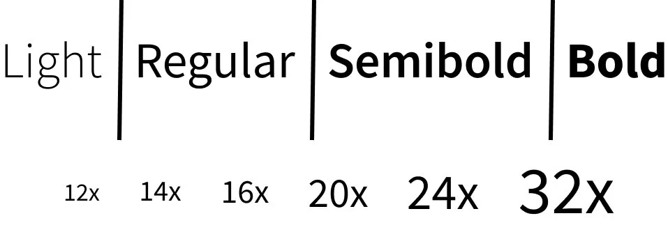
Typography
Components
Radio Toggle Button
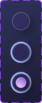
Selected Category

Alphabetic Keyboard

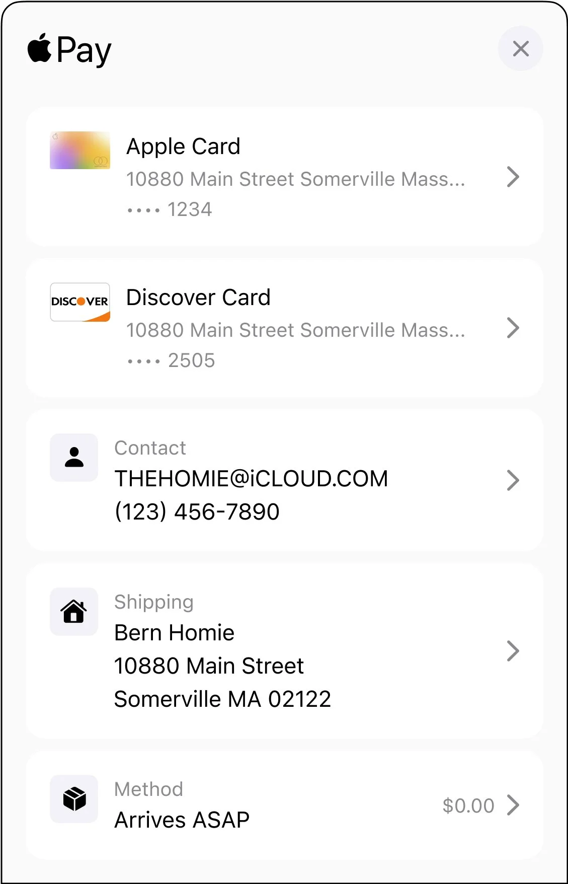
Apple Pay Summary
Icons
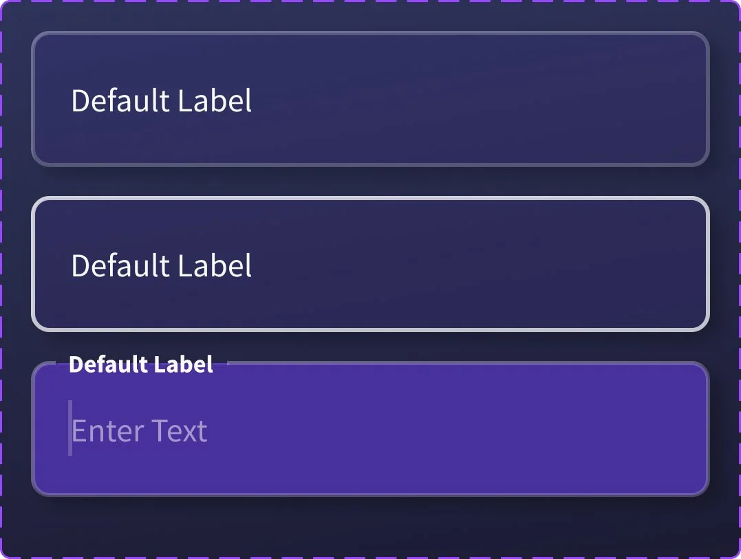
Input Field


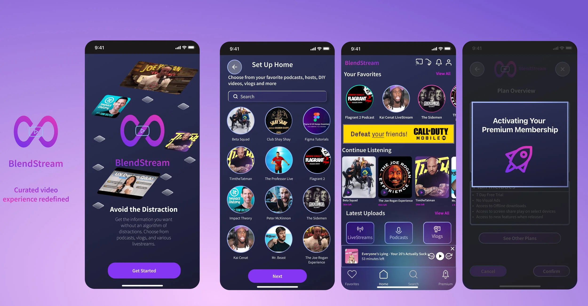
Final Designs
These designs are the result of a careful design process that includes user research and usability testing. It's been refined based on user feedback to make sure every part works well for users.
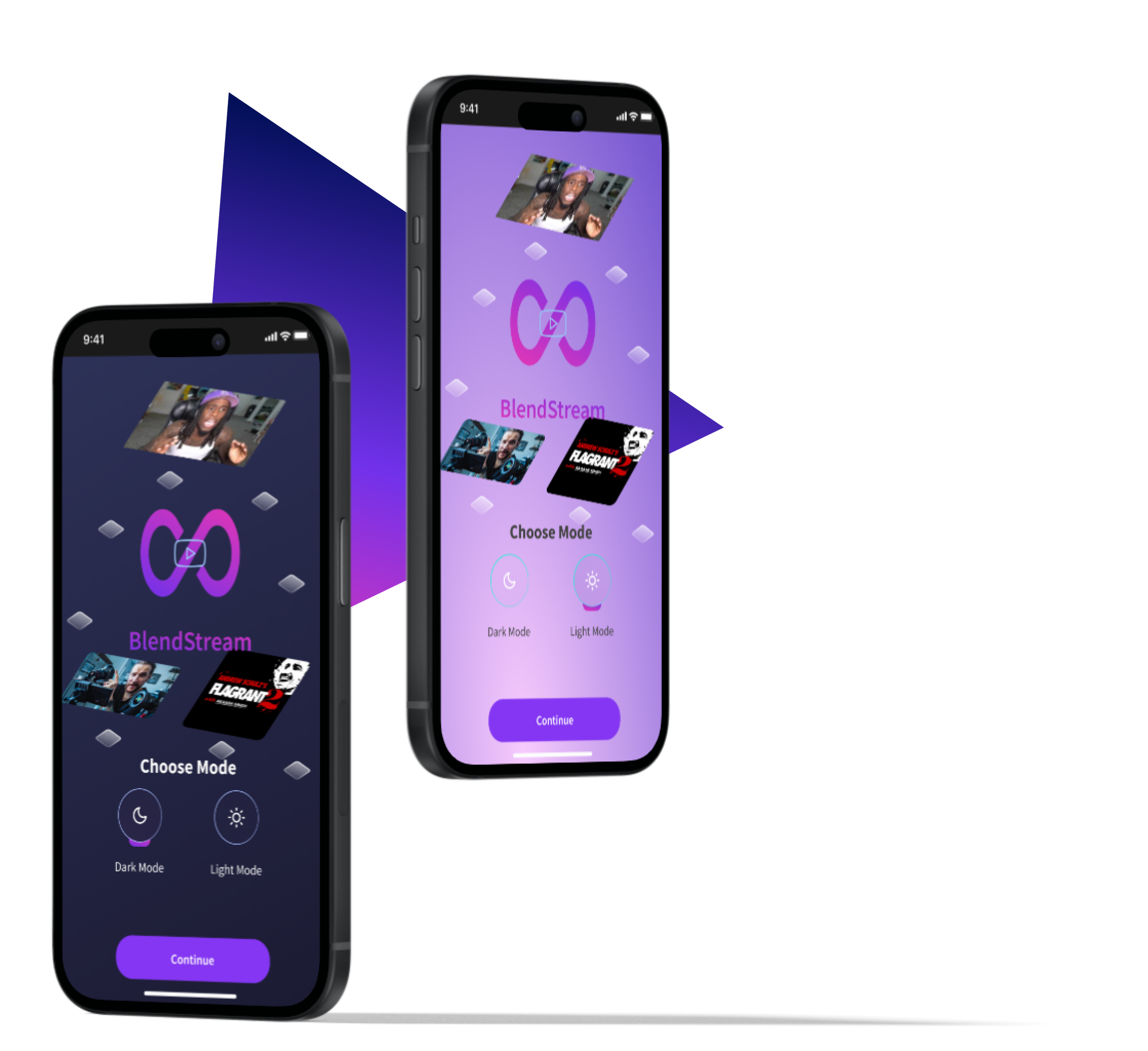
Light Mode vs Dark Mode
Offering both light mode and dark mode provides users with greater flexibility and personalization. With both options, users can choose the mode that best suits their preferences and environment, ultimately improving their overall experience.
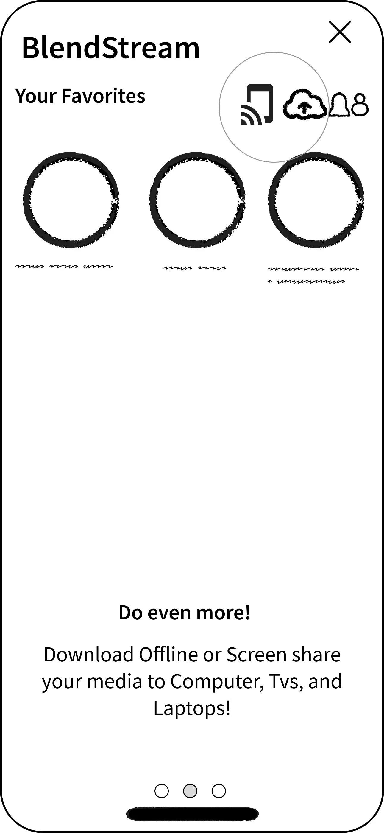
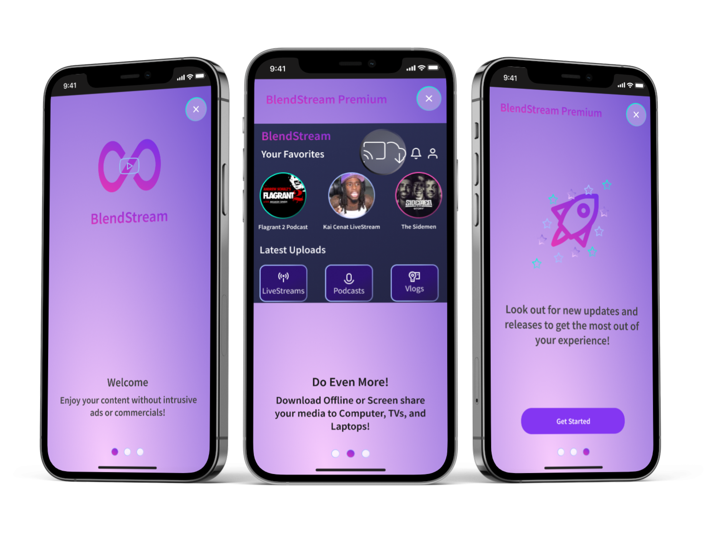
Access to Premium Subscription
Upon onboarding, both free and returning users are immediately offered access to subscribe to premium offerings within the app after signing in.
Playing a Video Opens pop-up ad
For free users, playing a video will initiate the prompt pop-up ad displaying premium offerings and benefits to incentivize and remind free users to join Premium.
Premium Offerings
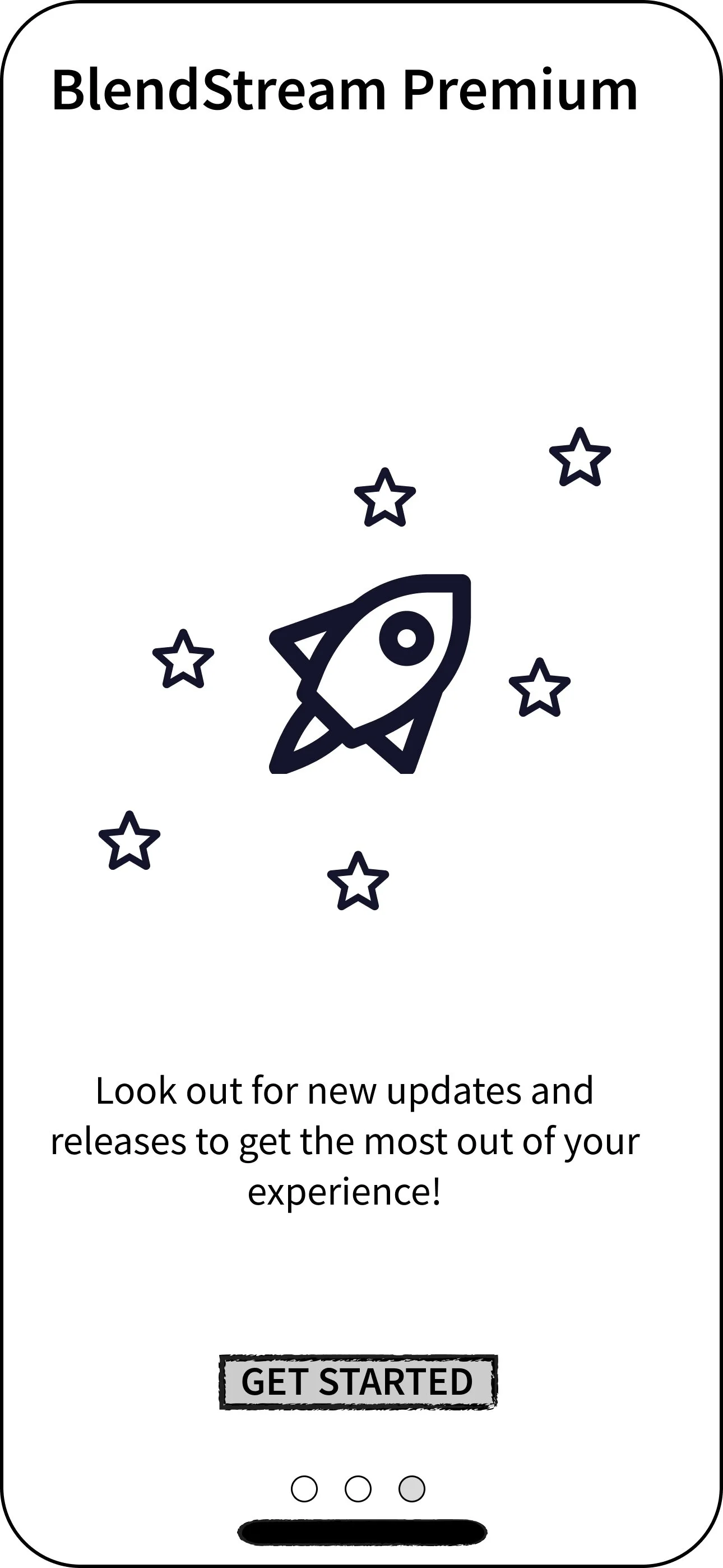
After subscription to the Premium Plan, users are displayed what is featured with their new plan and what to look out for in future updates.
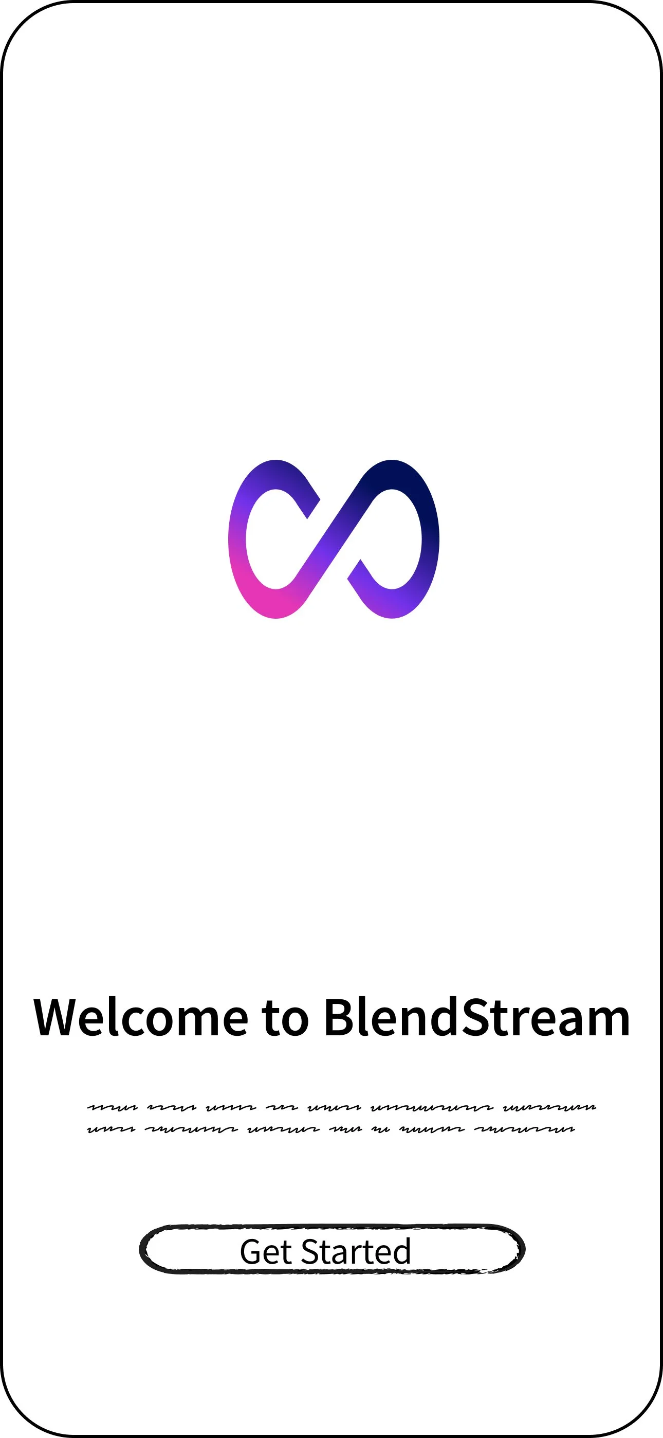
Splash Screen
When the app is launched, users are presented with an introductory screen that seamlessly transitions to the main interface.

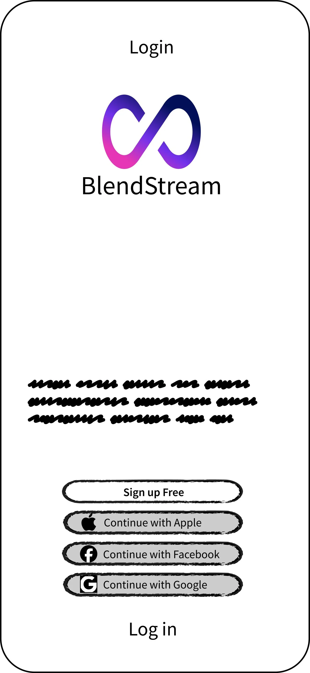
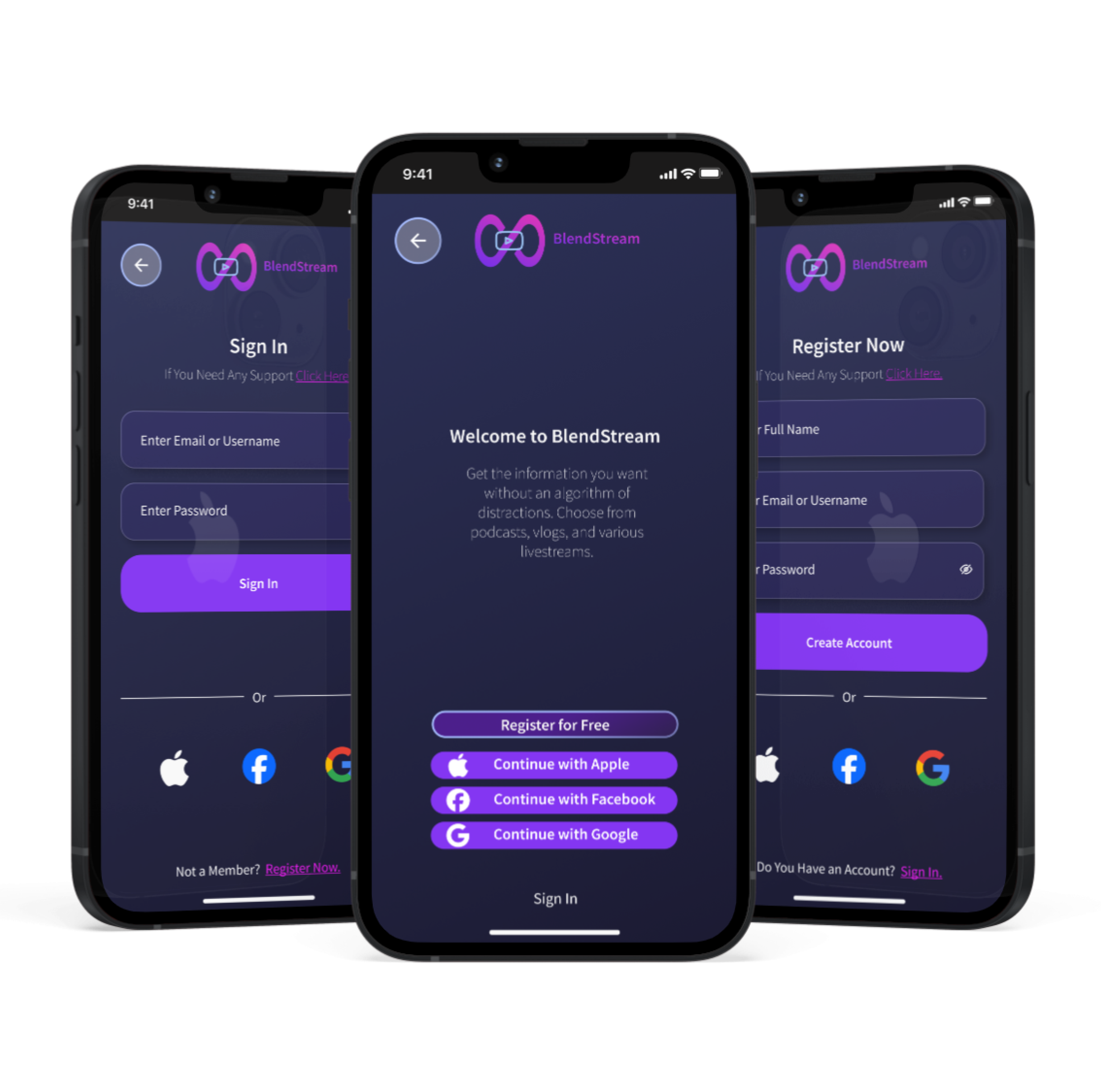
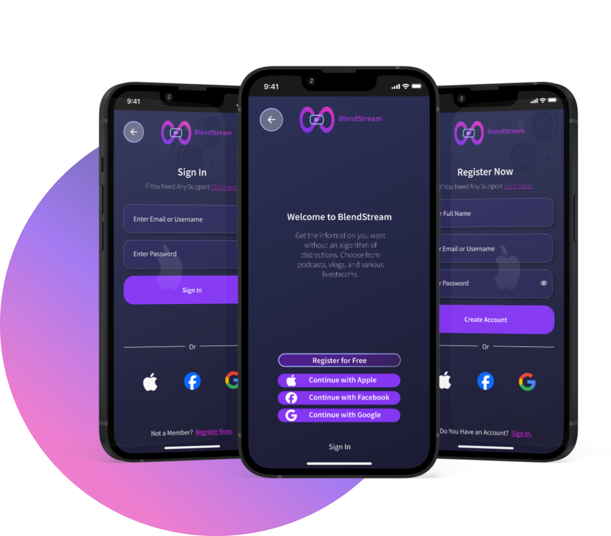
Onboarding Process - Login & Register New Users
The onboarding process offers returning users simple ways to quickly sign into the app from SSO offerings via Apple, Facebook, and Google. Returning users can sign in with email and password while new users are prompted to register for free to create an account and access the app.

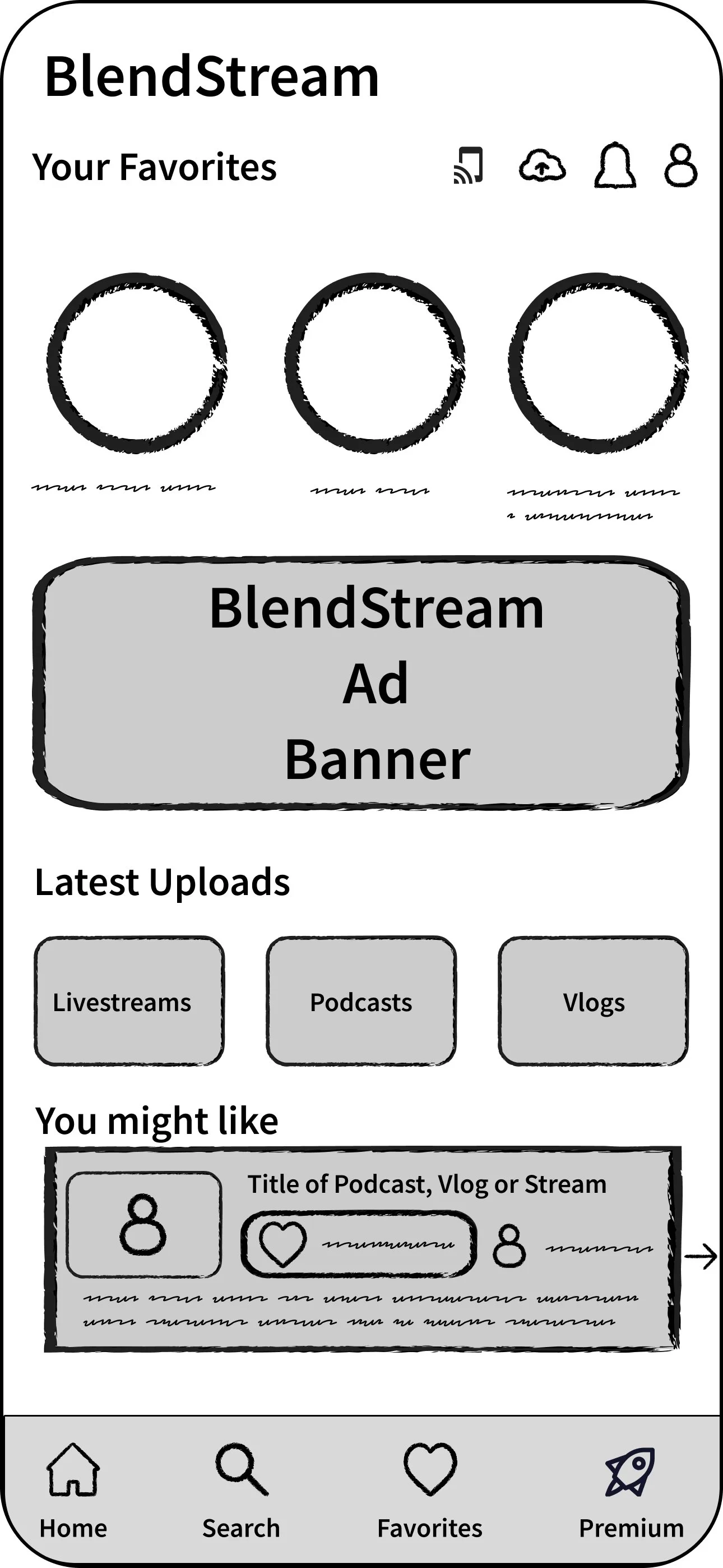
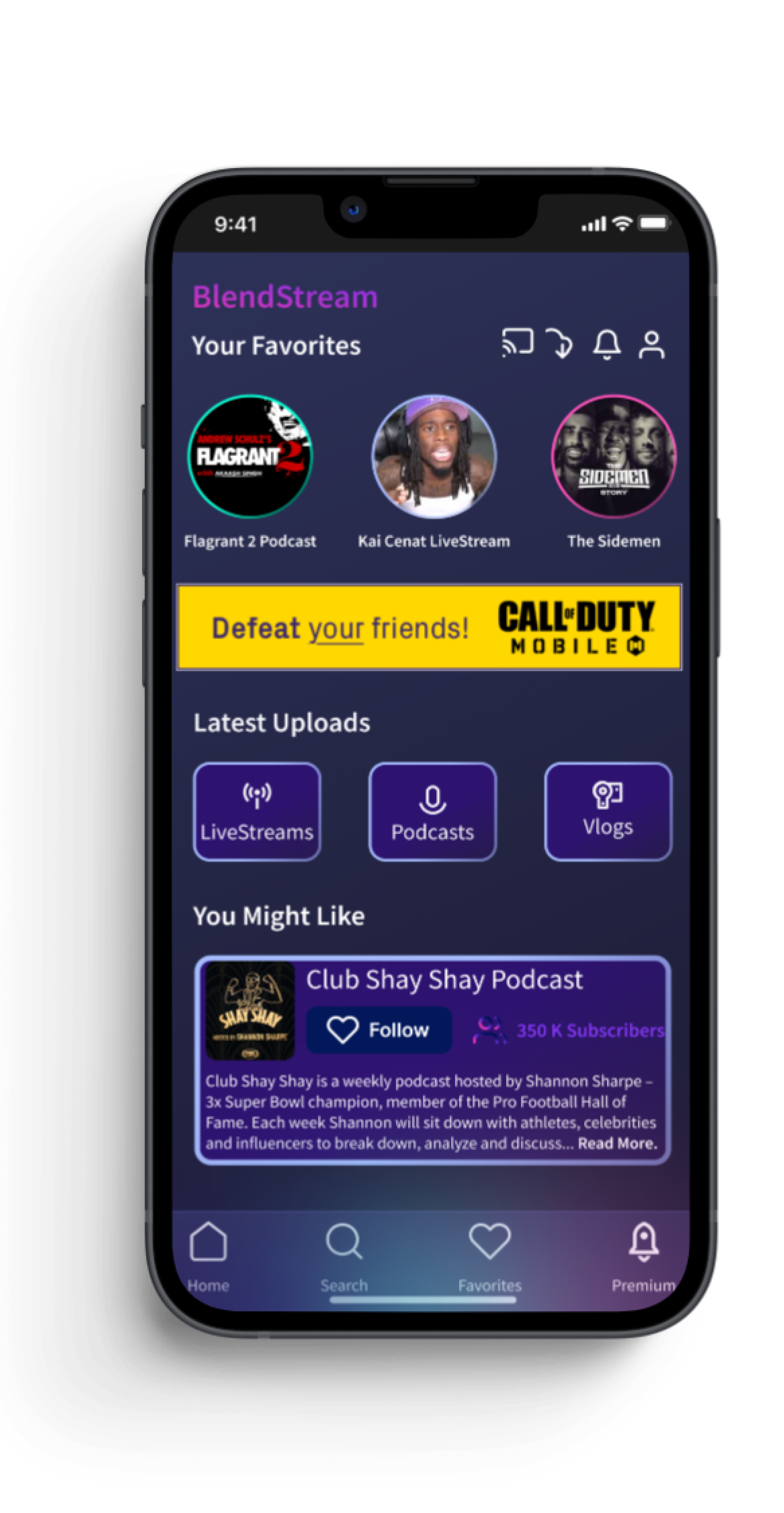
Homepage Free User View
The Homepage displays at the top of the screen view of the users’ favorite artists or hosts based on the users’ selected preferences from the onboarding process. Mobile ads are displayed throughout the experience for free users, incentivizing users to upgrade to Premium. Horizontal and Vertical scroll allows for an easy intuitive experience. The navigation bar at the bottom of the screen displays a call-to-action to learn more about Premium.

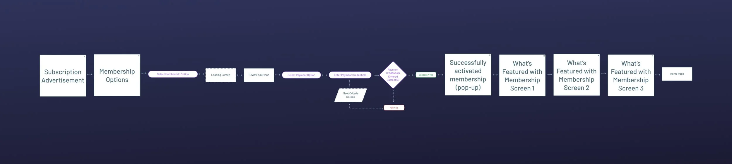
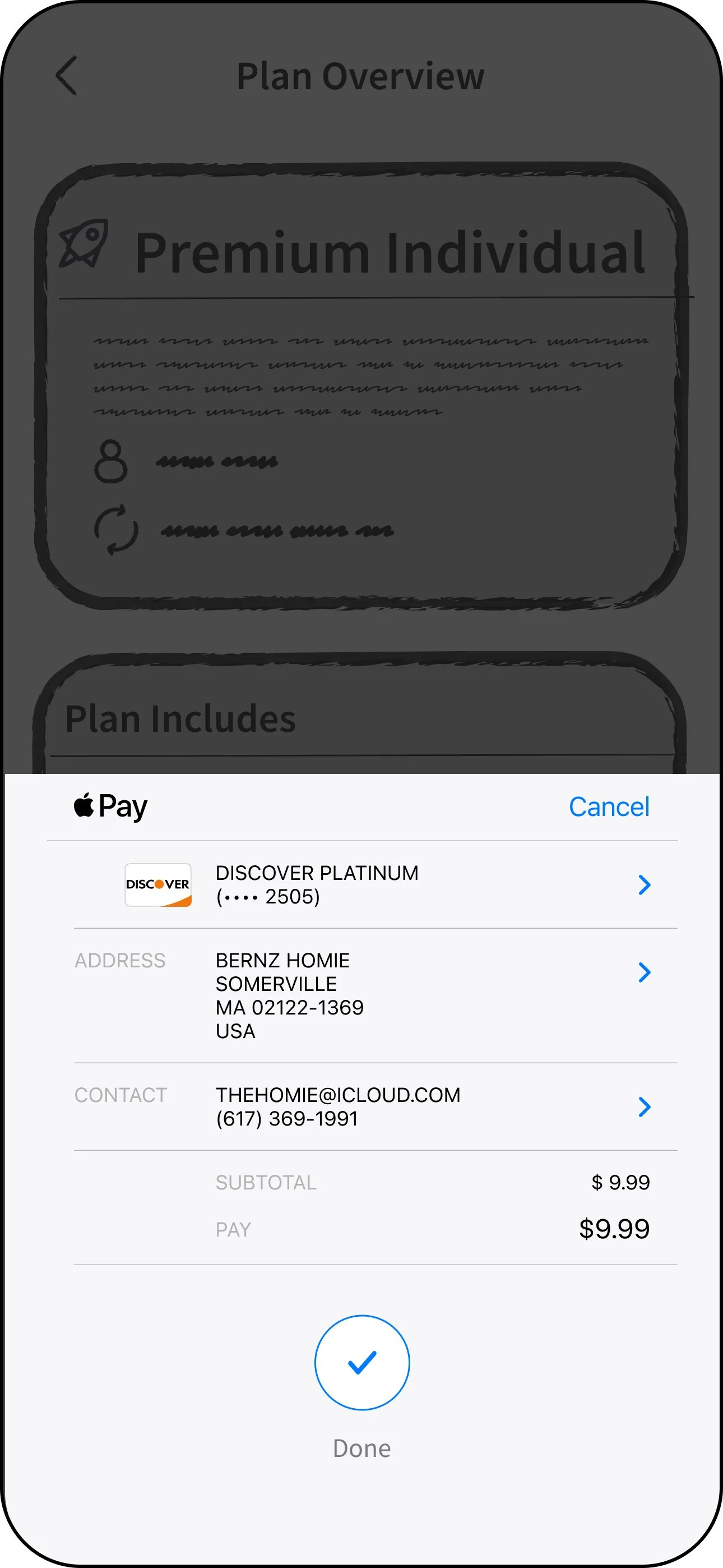
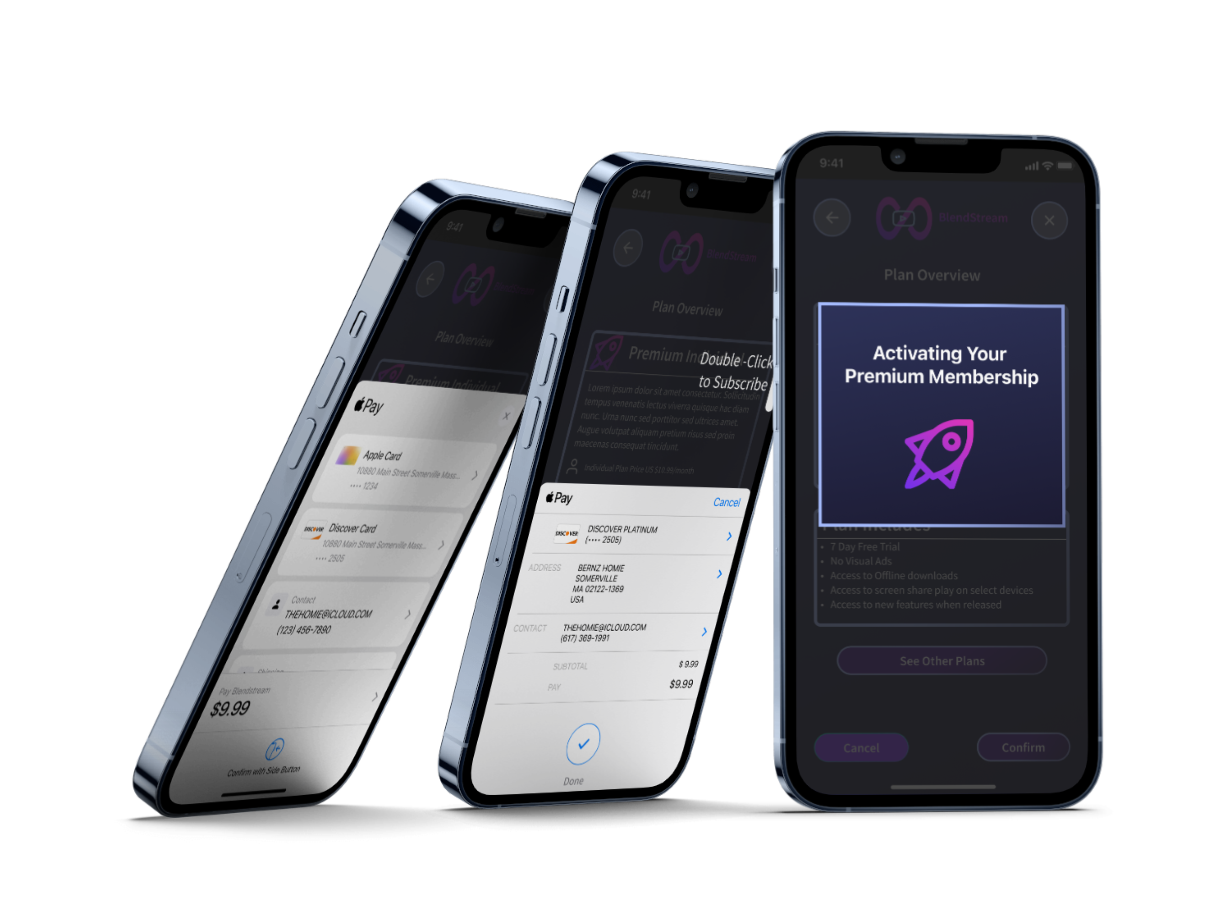
Premium Purchase Process
After selecting, Try Free and Subscribe, users will be able to view available plans and select their membership. Users are then asked to review their plan and select their payment option. Upon successful payment, members are then able to access premium offerings.
User Testing -Round 2 Testing
The purpose of the interview was to get the users’ general opinion on the current design and to discover possible usability issues. Users were asked to complete simple tasks within the app.
Tasks to complete
Create an account in the app.
Close the Ad pop-up.
Play ‘Flagrant 2 video.
Try for Free and Subscribe for Premium choose the Individual plan.
Choose the Discover Card to pay.
Scroll down on the home page to the “You Might Like” section and select the ‘Impact Theory’ podcast.
Click Favorites to view your Playlist.
Return to the Home Screen.
“The experience immediately feels less cluttered without the ads and allows you to see everything available with Blendstream.
”

Testing + ImprovementsDesign Improvements over time
A pop up from a down Flat Look


Issue
Outside of the offerings available with the Premium Subscription, there was not much to give the users to personalize their experience.
Solution
Offering both light mode and dark mode provides users with greater flexibility and personalization. Light mode offers a crisp and bright interface, while dark mode reduces eye strain in low-light conditions and enhances readability in the dark.
Issue (Left)
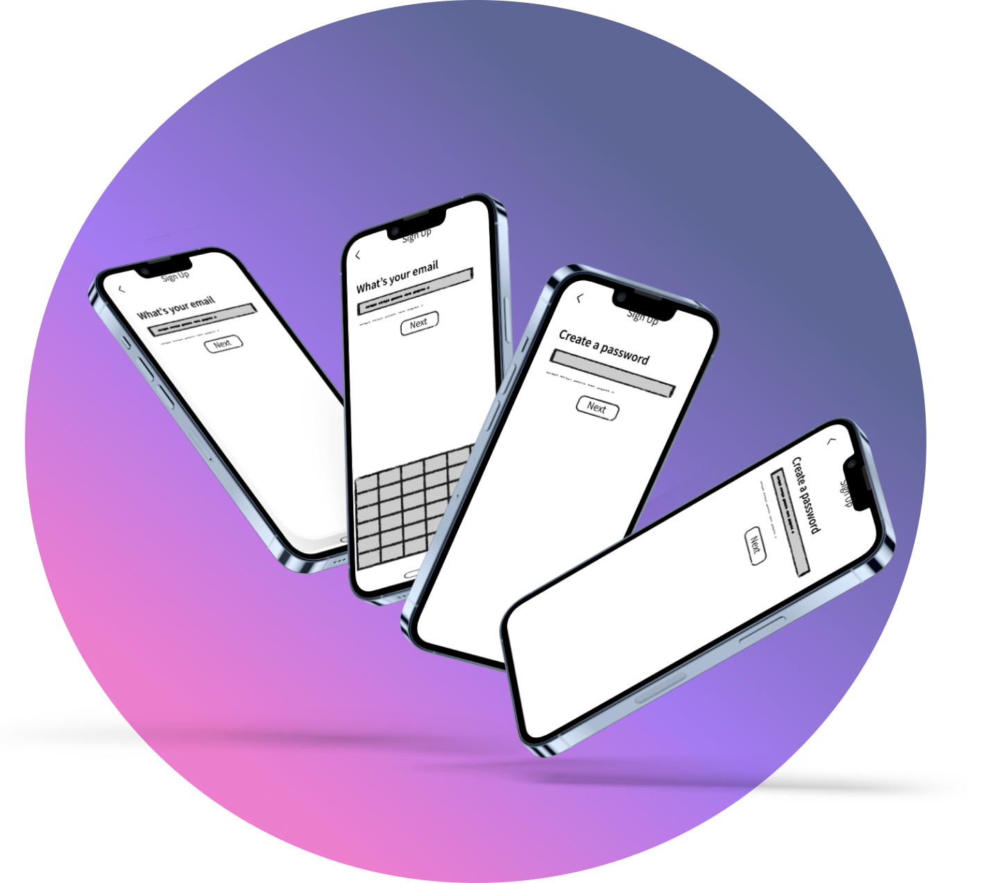
User journey of the onboarding process was to many screen for simple inputs to create an account.
Solution (Right)
Creating a component featuring a keyboard overlay allows for simple access to enter email and password information on the same screen rather than multiple screens.
Issue (Left)
Feedback from users explained how the look and feel of the app was dull and flat.
Solution (Right)
Adding the gradients, shadows, and testing out different colors helped allow the design to pop more and give a more realistic feel to the experience.


Final Design
Final thoughts

Key Takeaways
The Onboarding process is an important step for initial conversions: This is one of the best places for users to subscribe so it’s important to give users this choice early on and let them know the benefits of a subscription.
Sustained Engagement: People need to be reminded of the premium version throughout the app journey. This can be done through pop ups or whenever they attempt to watch a premium content.
Preserving the quality of the Free Version: It’s important to still keep the quality of the free version good. This is what will keep the retention rate and have the possibility of converting free users to subscribers.
What I would have done differently…
Given the constraints of limited time, achieving a complete user experience was challenging. With additional time, I would have expanded the settings section to include more screens dedicated to account information and easier access to view and switch between membership plans. Furthermore, with more resources at my disposal, I would have eagerly developed additional components to enhance the user's interaction with media content, ultimately enriching their overall experience on the platform.