
Design Sprint Case Study
House2Home
Overview
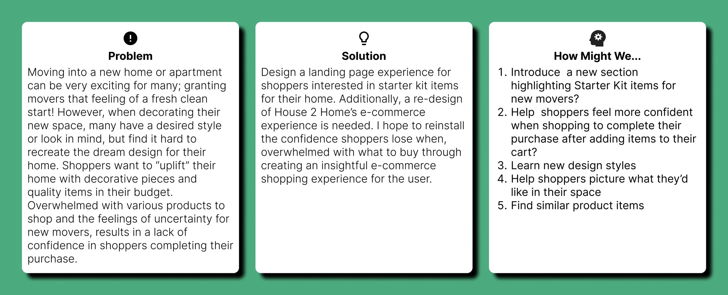
House2Home is an e-commerce website that sells home decor items, prints, lighting, and accessories. Research shows that many of their customers have recently moved into a new home or apartment. New movers aren’t confident in what to buy when decorating their new place as a result, they stall in their purchase of what to put in their cart.
Project Type
Google Design Sprint
Duration
1 Week
Tools
Figma, Miro
Challenge
First off, designing a solution within 5 days! With no team this definitely felt like no easy task. Understanding that House2Home's shoppers aren’t confident with what they add to their cart when shopping for items led me to think that they might need more information before completing their purchase. In addition to a new landing page for Starter Kit Items, I began to think what other options might we best inform the shopper with what they need to feel confident with their purchase.Constraints
Design for users for want a starter kit of various items to decorate a new apartmentDesign for desktop & laptop usersDesign for multiple products being purchased (Price Range - $10-$50)
Role
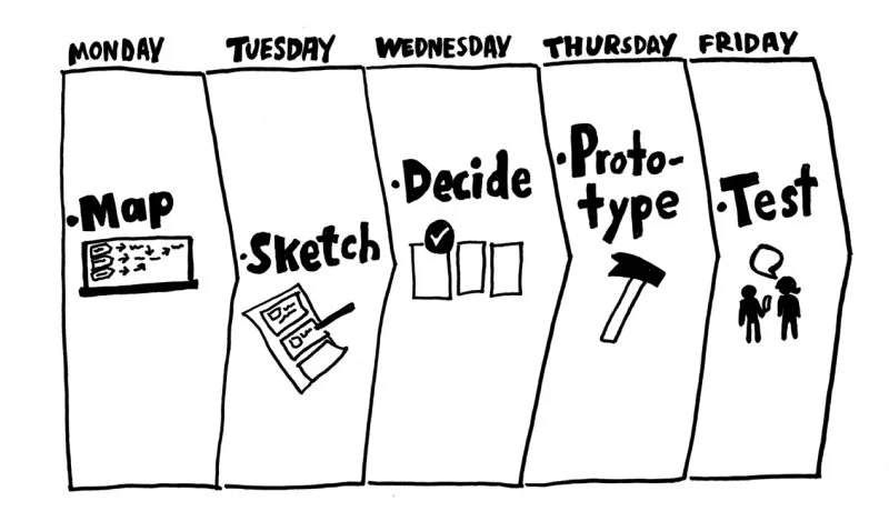
As the sole UX / UI Designer for this design sprint, my goal was to analyze the research data, map out the user journey, and finally design a prototype solution ready for testing.Day 1: Key Insights from UX Research &Journey Mapping
The goal for DAY 1 is to familiarize myself with the task by reading the existing research, persona data, and user interviews provided by the stakeholders. Understanding the problem, the constraints of the company, and the “shared” goal for both the user and stakeholder I started to come up with solutions to our goal.
User Journey Map
Day 2 Sketch Lightning Demos
Next, I did a competitive analysis by looking at solutions competitors have produced to solve a problem similar to my own. Searching the web, I found that most of my competitors provided an experience that inspired the confidence to shop rather than a curated list of starter kit items for a new home.


Crazy 8s
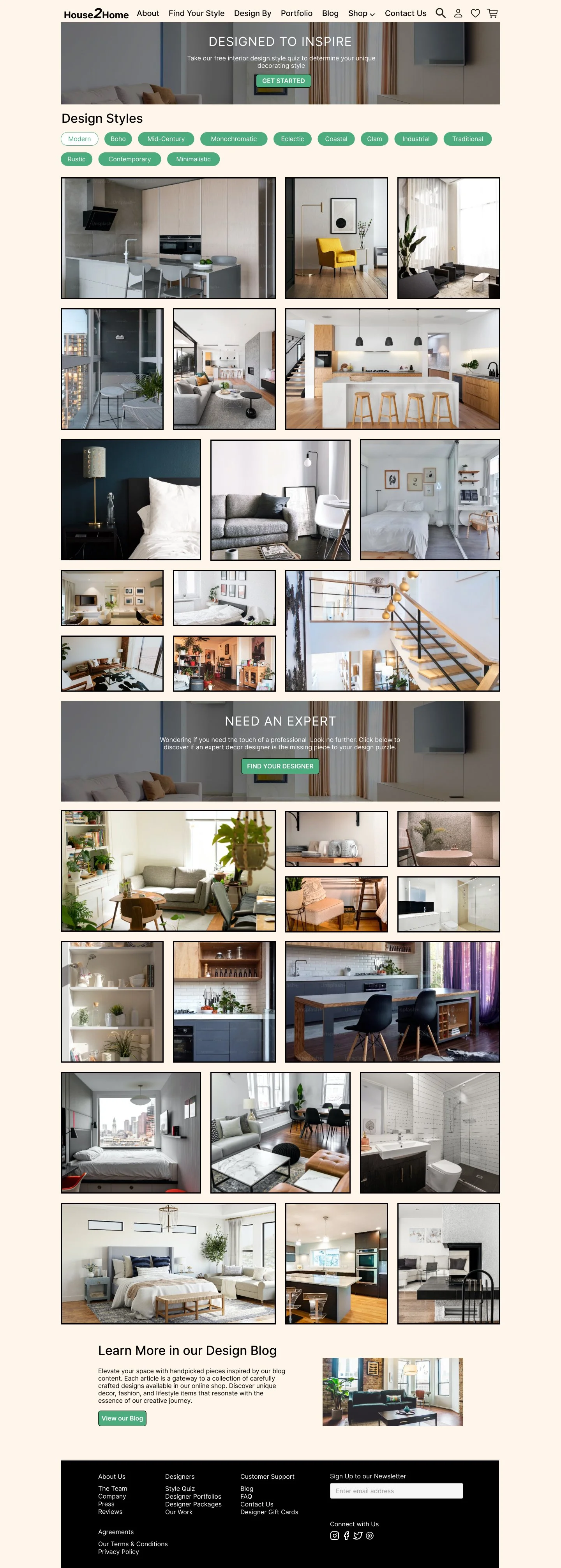
I used the home page as my important screen for this exercise. The home page is the main introduction to the website. Here, is where there are updates on new products, details on the most important information, and how best to navigate when lost. With an updated, informative, and easy-to-understand home page, I believe the shopper will feel more confident that they are in the right place to find what they are looking for or at least know where to look to learn more information.
Solution Sketch
With the “Home” page as one of my critical screens, the other two critical screens to complete my storyboard would be the “Design By“ page and of course the “Starter Kit“ page. Upon landing on the home page and not initially clicking on the header CTA for the starter kit page. A shopper may take the time to look at and explore new designs. A shopper may visit the Design By page to see different styles of interior decor design for some homes. On this page, the shopper can view designs by choice of rooms in the home, by interior design style, or by the latest trends in interior design. Located in the Trends section of the Design By page, the shopper can find the Starter Kit section to see different items used to decorate and design homes of various styles.
START

Home Page
EXPLORE

Design By Page
GOAL
Starter Kit Page
Day 3 - Decide
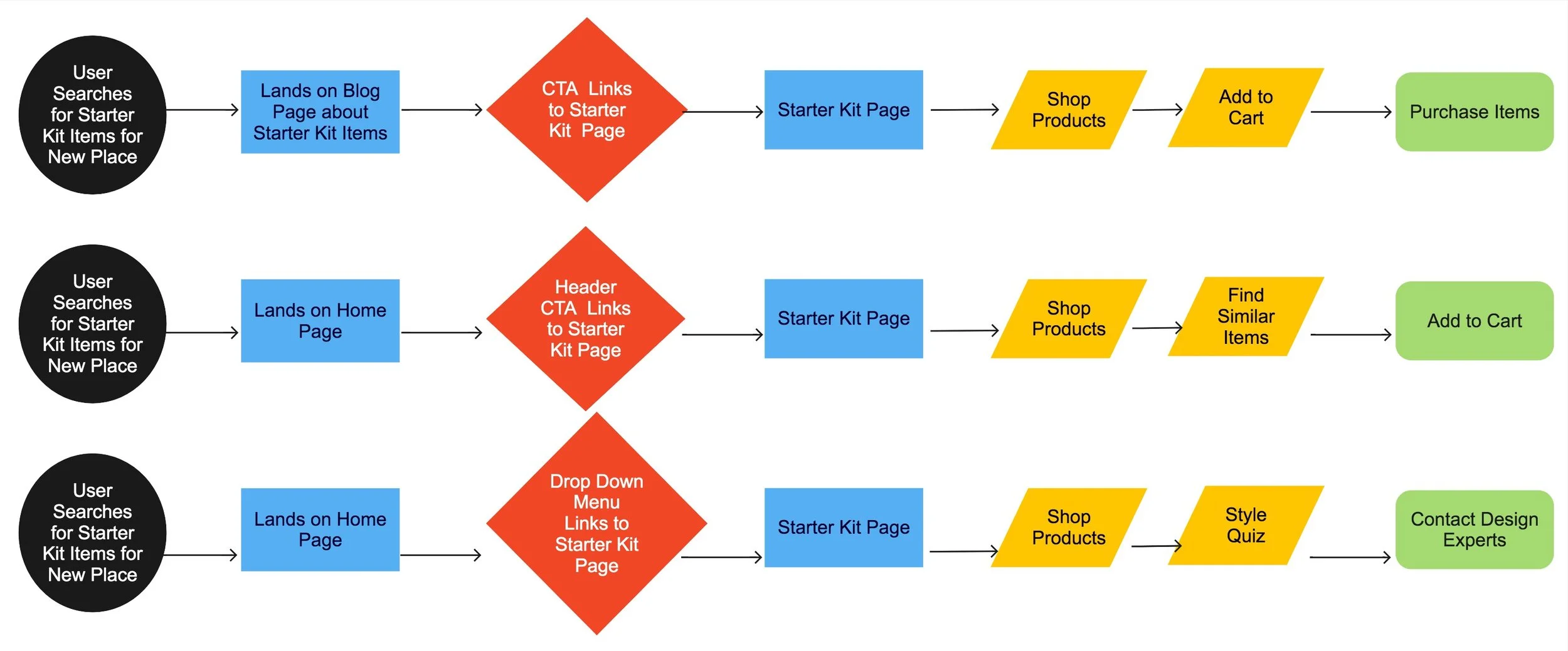
Before making the full experience in Figma, I decided to list out the various “User Flows” a shopper may journey through upon visiting this site and how one would find the Starter Kit section to learn more.
User Google searches "essential items for a modern design style" and lands on the House2Home home page
From the home page, shopper navigates to the drop-down menuReading a blog post, a CTA links reader to the House2Home Starter Kit pageViewing the work of expert interior designers seeing what items were in the designProduct item searches online brings shoppers to the shop all products pageProduct items will feature an indicator of whether the item is a “starter kit” item
Storyboard Panel
-
![]()
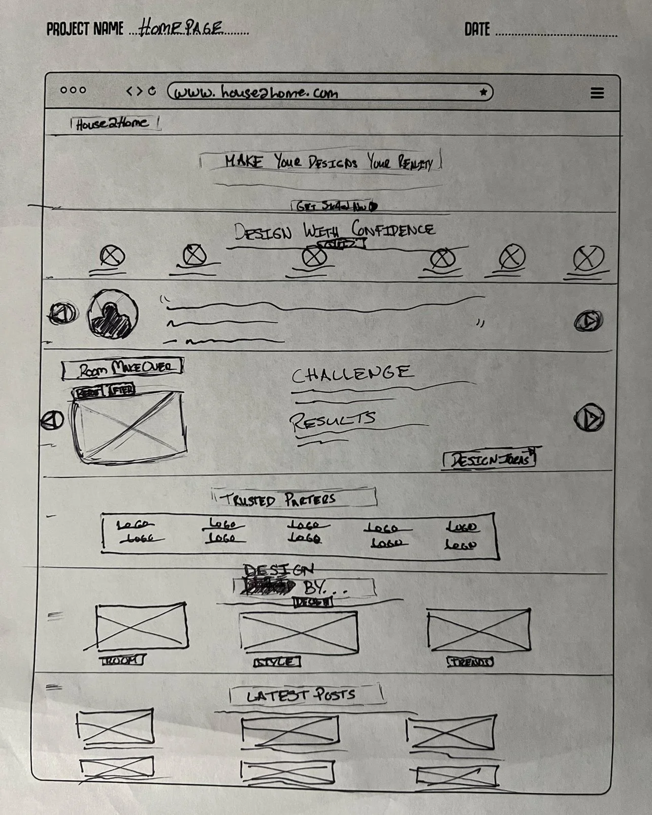
Step 1 - Home Page
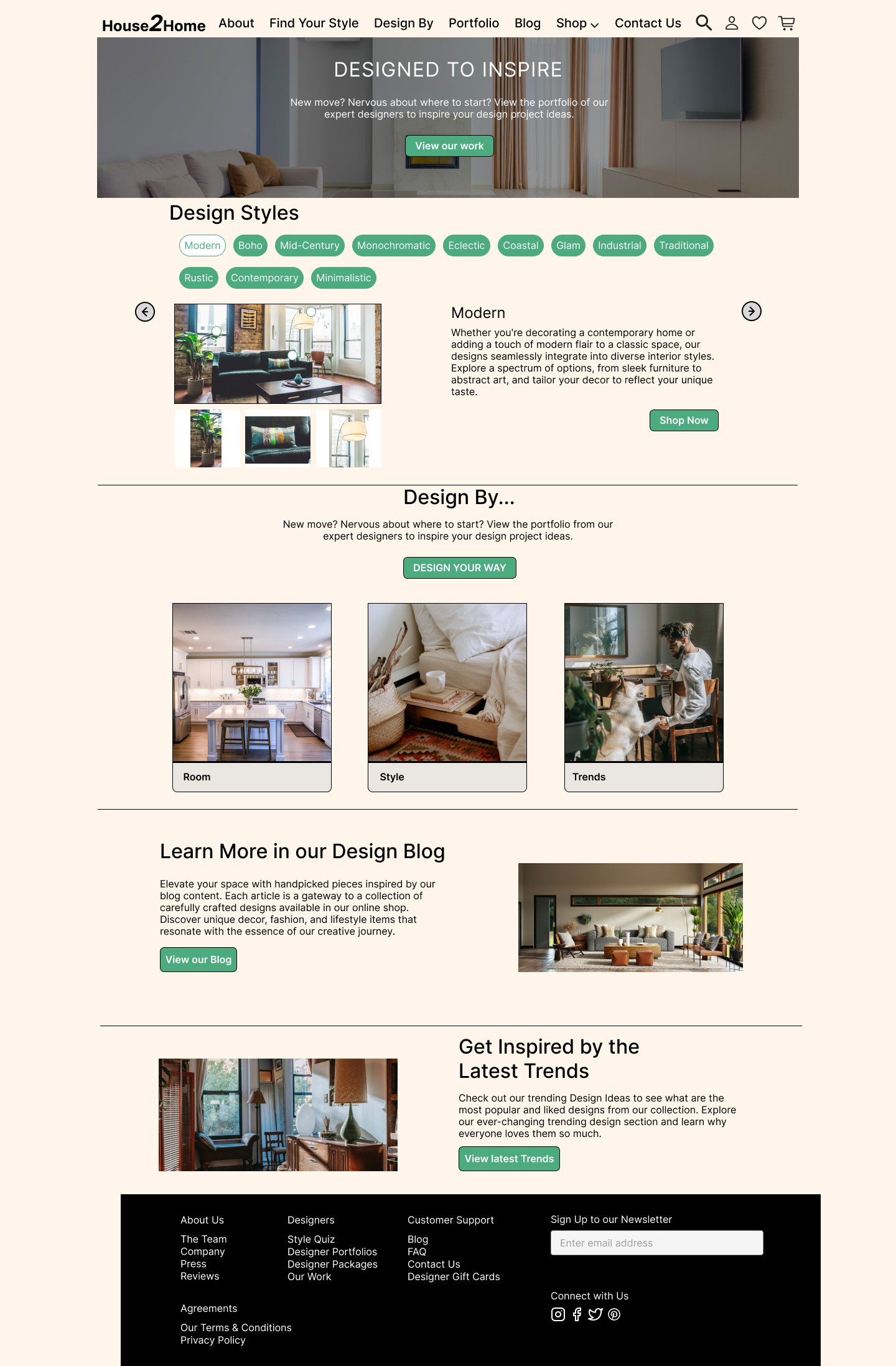
Updating the homepage and offering more information upfront to the shopper will ease the cognitive load as they learn while they explore the site. In the header of the page, I created a “Get Started” CTA to guide new movers to the Starter Kit page.
-
![]()
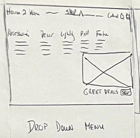
Step 2 - Updated Nav Bar
With a redesigned Navigation menu, shoppers can easily find what they are looking for. Selecting the shop drop-down, displays what shoppers can use to easily find what they are looking for. Here is a second path for shoppers to find what’s featured on the website and locate the Starter Kit section.
-
![]()
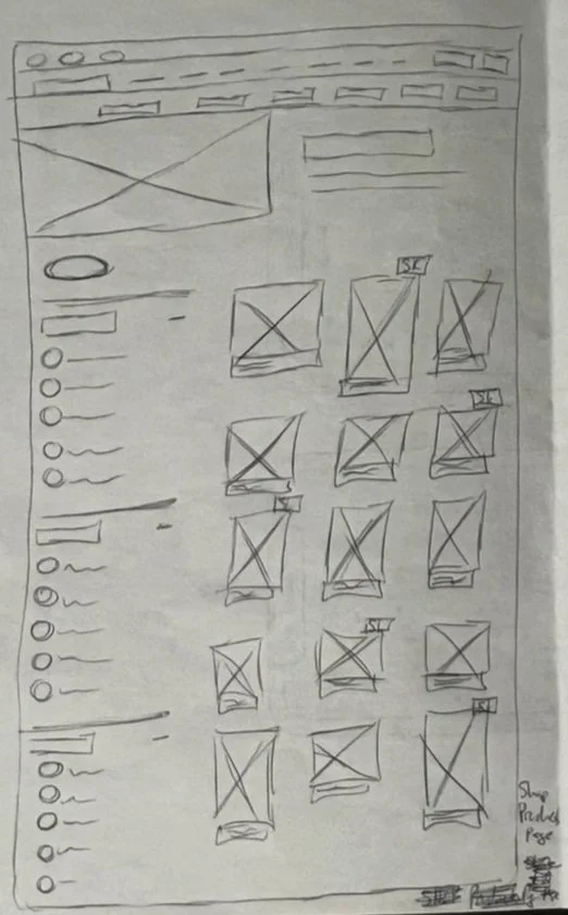
Step 3 - Shop All Products Page
From the drop-down menu to the Shop All Products Page, shoppers can view products they are interested in with a filter menu to sort between brand, material, and color. As the shopper views the various products some products will have a featured “indicator” highlighting whether the product is a “Starter Kit” item.
-
![]()
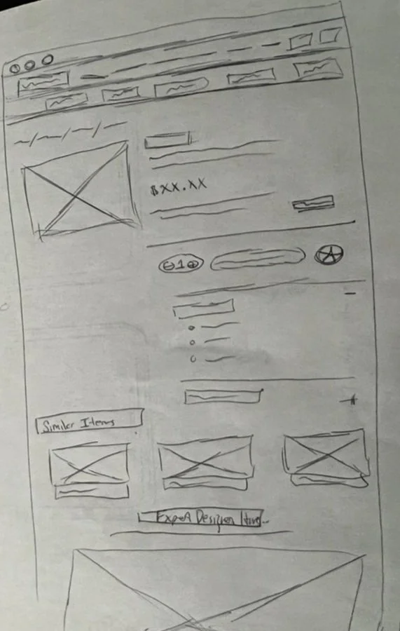
Step 4 - Product Item Page
When a shopper selects an item, they will be able to view the product details of the item and see similar items. Also within the page, will be a section to guide shoppers to the Starter Kit page if they have gotten lost.
-
![]()
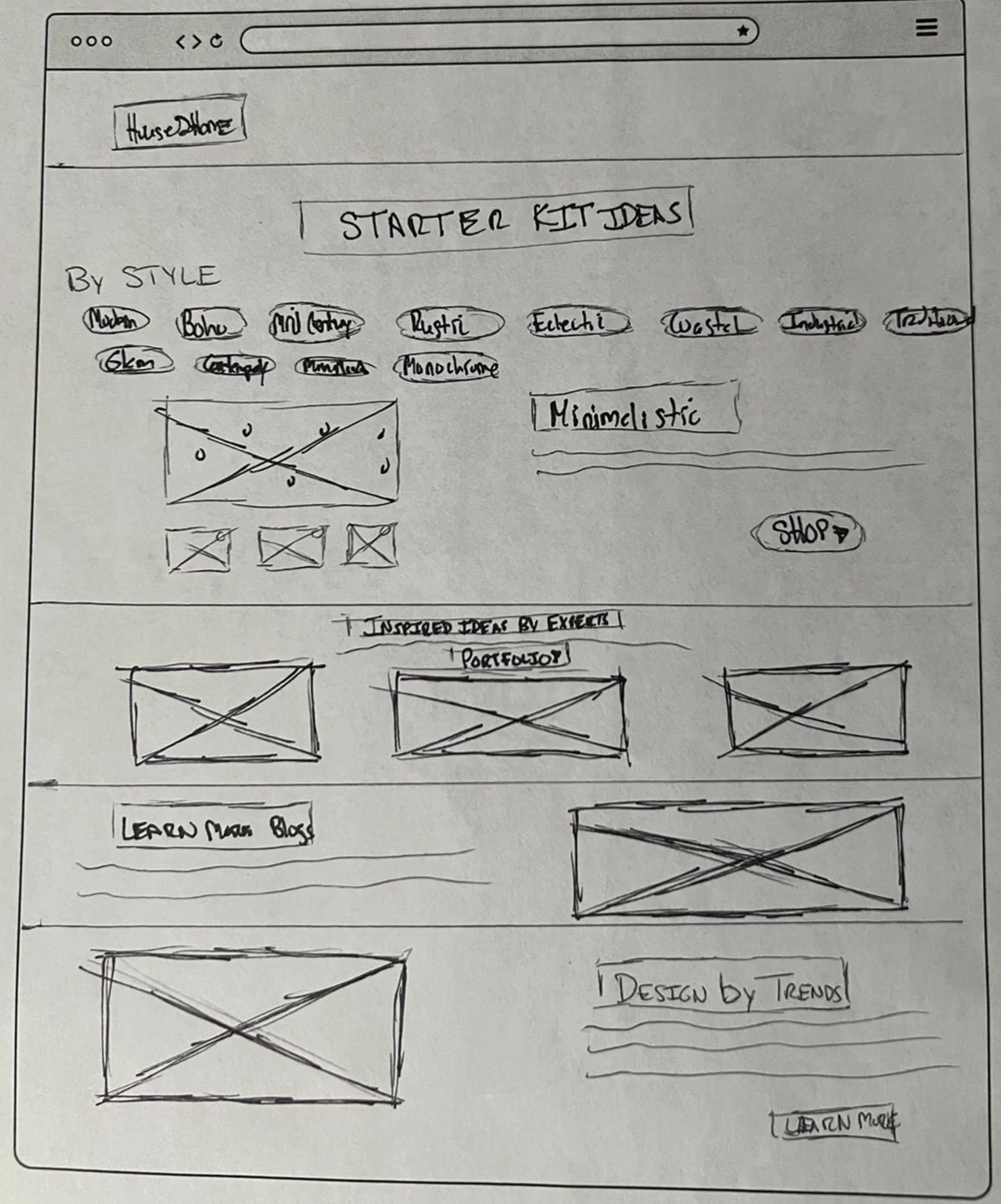
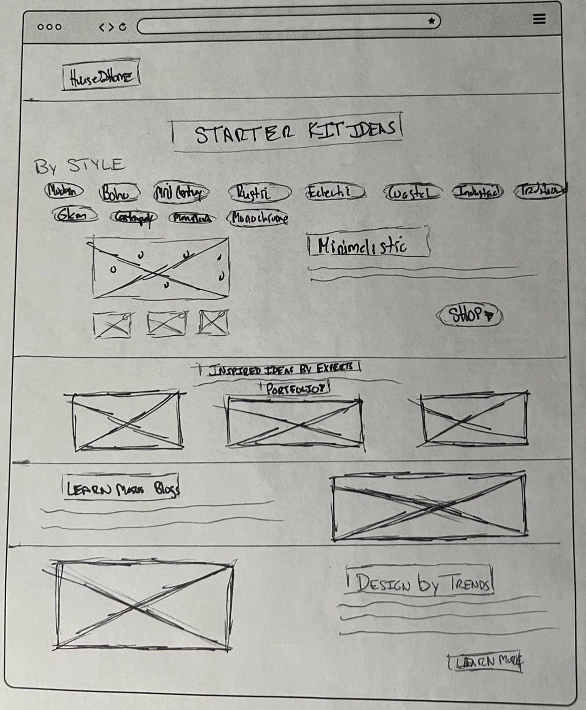
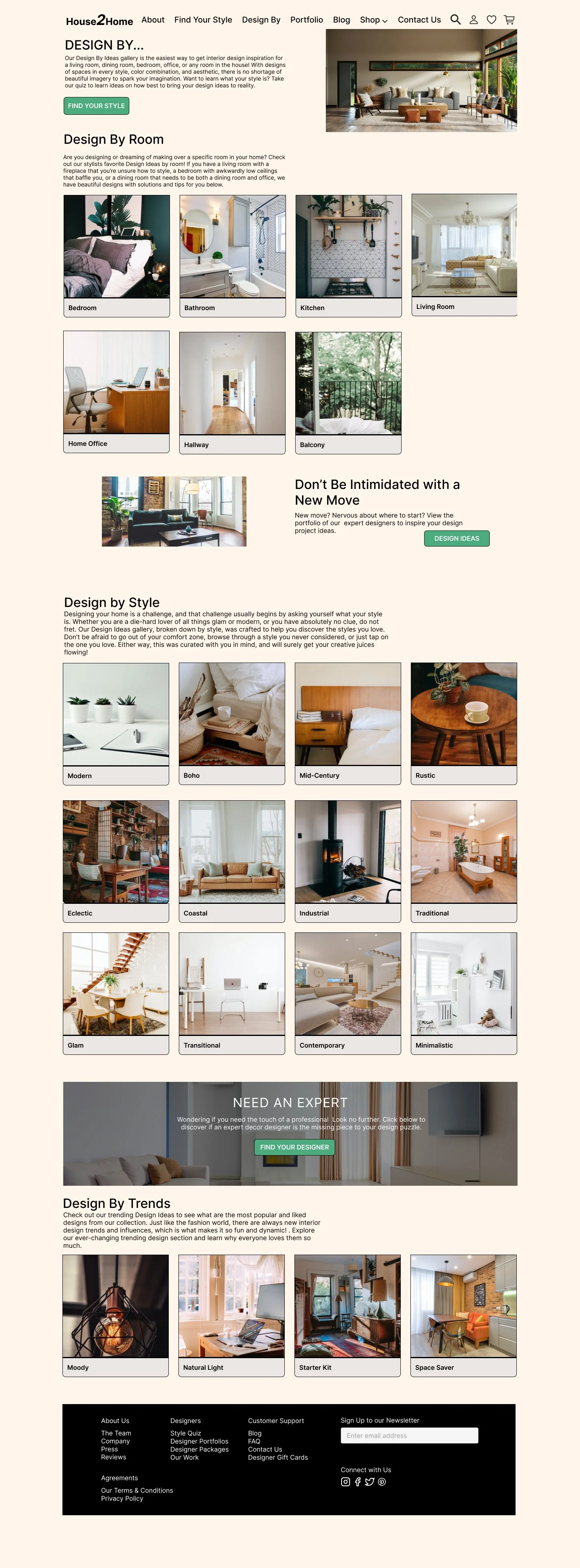
Step 5 - Starter Kit Page
There are several ways to guide new or returning shoppers to the Starter Kit page. On this page, shoppers can view different styles of decor to learn from, view the portfolio work of design experts for inspired ideas, and learn more from the latest posts in the design blog. This page informs the shopper on style, section ideas by room or trends, and provides examples of the product items in rooms in the styles our shopper is interested in.
Storyboarding puts in perspective the journey or flow my shopper will take on this site. Have I offered shoppers enough to help them confidently shop products for their new home? I thought by giving the user control, they could read the latest posts on home decor in our blogs section, explore different styles on interior design from our style quiz, and gain inspiration by viewing decor designs by the room, by the style, or by the latest trend. Finally, allowing them to connect with expert designers who can assist if they are still unsure. I believe this site gives the user interior design and decor knowledge to allow the new-move shopper to confidently complete their purchase.
Day 4 - Prototype
I built 6 main screens in my wireframe to test the MVP with users. Prototyping is one of my favorite parts of wireframing. It illustrates the ideas of the solution and makes it more tangible. I found it challenging to just focus on the main goals of the experience and not perfect every detail of functionality within the prototype. Can shoppers easily find their way to the starter kit page or know where to learn about starter kit items for their home?

Home Page
Design By Page
Starter Kit Page
Portfolio Page

Shop All Products Page

Product Item Page
Day 5 - Validation and Testing
I conducted 5 usability tests, 2 in person and 3 remotely over Zoom. Of the test participants, 1 was looking to move into a new home and 1 other recently moved into a new apartment.
The main goals for testing my prototype:
Does the design make sense for the user to easily navigate to find what they are looking for?
Could new move shoppers easily find the “Starter Kit” page to look for items to decorate their place?
Understand what would address “cart abandonment” to help shoppers complete their purchases.
Tasks for my test participant:
Take a minute to view the page from top to bottom
Do you know what style you want to recreate?
If you were to shop for items where would you go?
If you were looking for starter kit items where would you navigate to?
On this page, what do you expect to learn?
Is it easy to find similar items when shopping?
Would you feel more confident to complete a purchase knowing your design style, or viewing “before/after” photos of other homes redesigned with decor items and appliances from the website?
Takeaways:
Many felt that the design was very clean and professional and appeared as if it was not just a place to shop for products but you could learn more. All test participants found their way to the Starter Kit page easily. A major finding from testing was that participants felt confident that they could learn what they didn’t know about different design styles and find various items on this site with the filter menu on the Shop All Products page. They just don’t know how the item would look in their home.
“I really like the drop-down menu and the animation when navigating.” - Test Participant Marie
“I like that this site has everything you need to learn, explore, and shop I just don’t know how items will look in my place in terms of size of where to place it.” - Test Participant Bert
“I am not a new move shopper but I didn’t feel like the Home Header was prominent enough to highlight the Feature “Starter Kit” page, needs a larger image to take up more of the screen than a simple header image.” - Test Participant Eliza
What’s Next?
Iteration Recommendations:
With more time I would have like to continue working on the components or elements of the prototype like:
Update the Header image on the Home page to stand out more to feature the “Starter Kit‘ page.
Update the filter menu on the Shop All Products with more options
Create a categories toggle component to toggle between styles on the Starter Kit and Design By pages.
Create a “Quick view” experience when viewing photos on the Design By page, having a product pop-up experience when clicking a photo and seeing tags or indicators to show what items in the photo are available on the website for purchase and with some additional product details.
I would also like to add on the product item page a button to view the product in the shoppers’ room with Virtual Reality similar to Amazon Home.
I think these iterations to the design would address cart abandonment and help users complete their purchases.
Conclusion:
Designing for a 5-day sprint with no team is no joke! Having the initial research prepared was very nice, I enjoyed not having to do the majority of the UX research and focus more on a quality design. My biggest challenge was design for the solution and not to solution every part of my design. I enjoy wireframing and prototyping design details that I overlook at times my MVP is already ready to present and test and once tested, design updates will be made changing more to the design. I am excited to continue working on my design and next time work on a Design Sprint with a full team!